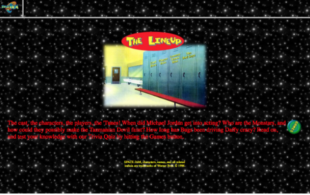
You wouldn’t dress in your ‘80s get-up in 2018, so why would you leave your website looking like Space Jam’s?
Websites are one of those things that can be hit or miss – nail the look and feel and you’ll reel in customers by the droves. Completely miss the target, and you might find yourself with a site that’s actually doing you more harm than good. And with 4.1 billion active online users across the globe, that’s a big pool of opportunity to sacrifice.

Caption: The Space Jam website hasn’t changed since 1996.
However, it’s not always so easy to pinpoint whether you actually need a full website rehaul or just a bit of a touch up. Here’s 10 tell-tale signs your business is in need of brand-spanking new platform...
- Not mobile-responsive
It could arguably be the most important factor of all, but having a website that’s not mobile-friendly is number one reason to consider investing in a new one. With over 60% of online searches being conducted on a mobile device, ensuring you’re able to be land in front of those eyes will pay off in the long-run. Add to that the recent Google algorithm changes to prioritise mobile-optimised websites in search result rankings, and you’ve got no reason to delay.
- Outdated is the new unattractive
There’s a long list of reasons why a user lands on a page and then decides to leave it, but staring at a tacky, unappealing website is probably up there. In fact, 38% of users are prone to abandoning a website if the content or layout is deemed “unattractive”. And while we’d love to say “never judge a book by its cover”, it’s pretty fitting here.

- It takes too long to load
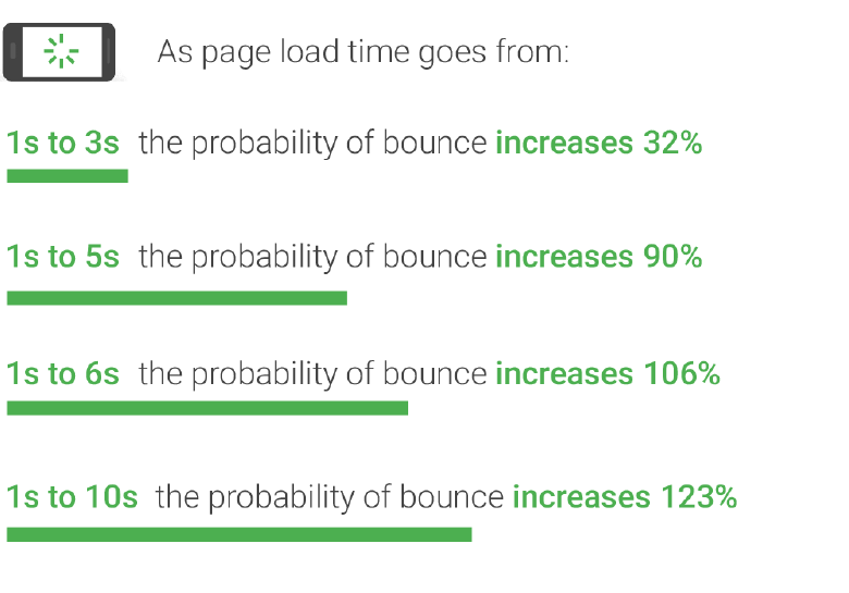
You’re sitting on the tram. You’re feeling a little adventurous and that funky new jacket is begging to land in your shopping cart. But the site is taking its sweet time to load, and you’re one stop away from hitting the office entrance. In frustration, you fling your phone in your jacket pocket and fly out the door. Another abandoned cart bites the dust. And it’s all too common. As we become more and more mobile (and less patient), user demand means that a site is most often abandoned if it doesn’t load within three seconds. Time is money.
- You’re not ranking...at all
SEO is a truly tricky thing to master, but if all efforts are going to waste and not enough results are being gleaned, it’s definitely time to opt for a fresh website. From easy navigation to usability and up-to-date content, Google’s bots will keep an eye out for sites that are modern, accessible and relevant to users. If you’re not quite on top of all those things, and actually getting around the site is even harder, there should be a giant red arrow pointing at this problem.
- Lack of conversions
Your website might get enough traffic, but the money coming through on the other end is not so impressive. Marketing costs can add up quickly, and investing hard-earned dollars in all other avenues of online advertising is literally redundant if your website can’t help convert those leads.
Firstly, ask yourself: is the user actually able to convert? That could mean a pop-up after a user has been on the website for a certain period of time, or visible call to actions in all headers and banners. A visitor will only convert if they are given the chance to.
- New branding
If you’ve recently gone through a bit of a brand refresh, that likely means refreshed colours, a snazzy new logo and content to go with it. But all of this needs to translate across your website, too. Keep your physical branding up-to-date with your online presence allows you to keep your messaging clear, concise and coherent.
- Content is still king
It depends who you ask, but content has long been the beholder of all good search rankings. And not just that – content helps guide and nurture leads through your website, showing them what to view, what to prioritise and how to take action. If you’ve failed to keep your website up-to-date with all of the must-knows about your operations, business or even industry, it’s time to get on the bandwagon and hit the keyboard. Not able to update your content easily? There’s a whole other story there.
- Consistency, consistency, consistency
Just as effective branding is vital, a great user experience comes down to coherency. If all of your pages look like separate websites, there’s a lot of work to be done. Those visiting your site should be able to glide from one page to the next without second guessing whether they have somehow navigated away to another platform. Ultimately, consistency comes down to a number design elements – namely fonts, design layouts, call to actions and overall branding.
- Your industry has evolved
No industry is likely to stay the same for years and years on end. Possibly the most significant changes in customer behaviour and technological shifts can be attributed to the retail sector. As the boom of e-commerce still continues to take over, web activity and user demand requires physical businesses to make a shift to the online world, in order to stay relevant. If you’re one of those businesses still stuck in the ‘dark ages’, it’s likely you’re missing out on online customers that may never set foot on your doorstep otherwise. If that’s not quite enough to light a fire under you, Australians spent a whopping$21.3 billion towards online shipping in 2017.
Keeping up with your industry’s ebbs and flows means adapting to what’s in demand, and if that means getting on top of a website that’s able to replicate your physical store, then it’s well worth the investment.
- It’s not considered secure
With the amount of cybercrime sprawling across the internet, webmasters need to opt for safe practices and strategies. One of these tactics includes adopting a HTTPS website – a measure usually indicated by the nifty looking padlock icon you may see next to the URL.
![]()
In simple terms, HTTP stands for ‘hypertext transfer protocol’ and refers to the way websites communicate. When a website is HTTPS, it’s ‘secure’ and third-parties aren’t able to ‘eavesdrop’ on important information. Previously this stamp was reserved for password fields and other private portals, but this has since been rolled out across a majority of websites. In fact, Google automatically uses HTTPS, meaning no one can view what you’re searching at the time. If you’re sticking with the old HTTP option, you’re leaving both your business and website visitors vulnerable to security breaches.
Okay, where to from here?
If all of these signs have been enough fuel you into action, you’re already on the first stepping stone. The next is to opt for a designer who can ensure all of these elements are weaved into a cohesive and attractive website that reflects your business objectives. But that’s the easy bit.
Get started by contacting a Website Design Australia expert on 1300 367 009.
