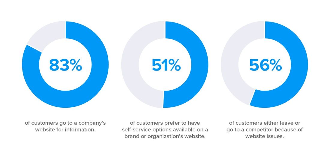
If you had a swanky business card in the past, you were pretty much good to go. Something sleek, irresistible and able to radiate the professional edge you needed. These days, ditching the business card isn’t so uncommon, with brands switching their attention, focus and investment into a flawless, powerful website. And for good reason.
Most users will read through an attractive site, rather than a dull or unpleasant one. So if you’re not putting on your best show, you’re likely missing out on key traffic, loyal customers and a growing user-base.
But beyond simply having a good website design in place, you’ll also reap the passive benefits of added security for your visitors, accessible layouts that complement SEO results, and a flair that positively expresses who you are as a business.
Econsultancy and Adobe discovered that 84% of survey respondents reported that businesses incorporating proper design aspects into their web strategy were far more successful than competitors. But for some, investing in a refreshed design isn’t as simple as just getting it done. There’s a lot to think about – from colour schemes, branding and content, through to primary messages, sales funnels and call to actions. However, taking the time to map all of these elements out will mean you’re well on your way to understanding how your business will be perceived online, and just in case you still find yourself on the fence, here are a few more reasons to take the leap…
Create a more professional online presence
As a user looking for answers, there’s nothing more unappealing than finding a potential business that provides the services or products you’re after, and then seeing their website doesn’t quite seem up to scratch. If you’re looking to be a leader in your industry – or at least generate more leads – the first step is coming off attractive enough to prospects. Outdated websites, clunky interfaces and subpar graphics will quickly turn your could-have-been customers away.

Modern websites rely on incorporating the latest design trends, flattering shapes and eye-catching features. These days, it’s common to see darker or neutral colours as the main palette, as businesses opt for a professional flair and an added sense of trust.
Pair that with lots of white space, minimalistic icons and clean designs, and you’re on the right track to ditching the 1990s-esque platform and replacing with a powerful, lead-generating presence.
Include new features, security and a responsive touch
We’ve said it before, and we’ll likely say it a thousand times more: a responsive website that features optimal security is the be all and end all of a well-functioning website. The Secure Sockets Layer (SSL) aspect of websites is the most widely used ‘security protocol’ method on the net. In a nutshell, the protocol allows a secure connection between the user viewing the website, and the actual web server of the site they are visiting, allowing for less risk of threats and breaches. Previously, this feature was reserved for high-risk domains like login pages and banks, but is now commonplace for all platforms. In fact, the amount of encrypted traffic on the net now surpasses the amount of unencrypted. Incorporating an SSL encryption into your new design will help increase a positive customer perception by displaying the trusted icon in the URL bar.

An example of a secure vs. insecure website
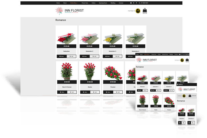
But aside from demonstrating the security of your website, adding in the critical feature of a responsive design will set your business apart from competitors who are lagging behind. Allowing users to navigate easily through your website will charge up your lead generation far more than a clunky design that confuses and frustrates your audience. These days, it’s the golden rule to have a responsive layout that eliminates the need for users to scroll significantly or zoom in and out, while viewing on mobile device. As users become more and more mobile, and consumption of content on-the-go rises, the need to cater for this behaviour is vital. That means ensuring your new website is responsive enough to allow users to visit your website with zero hassle from their desktop computer or on their mobile device.

An example of a Website Design client with a responsive website.
Additionally mobile-responsive websites have recently been noted as ‘favoured’ by Google algorithms, meaning platforms that offer this modern user experience are more likely to rank higher than competitors that don’t. This added SEO benefit is a noteworthy one, allowing you to access increased traffic and real estate on the top pages of the world’s largest search engine. Add to that the ability to add in new widgets and roll-outs as they come – like live chat desks and bots – and you’ll find your website is a far more powerful lead generation tool than it once was.
Look the part
Okay, so you find yourself in need of a shoe repairer who can fix your favourite pair of kicks. You’re not too aware of many in your area, but you hear there’s one down the road, so you decide to take a stroll. But when you get there, the signboard is close to hitting the concrete, the logo on the front window has seen better days, and there is dust piling around the door frame. You can see the repairer eagerly waiting for you behind his counter, but you decide your beloved shoes deserve better.
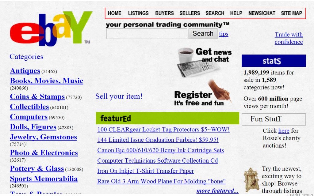
We’re all prone to judging a book by its cover, and that’s not uncalled for. Businesses who do not allow themselves to be represented positively on the surface – like the shoe repairer’s very outdated storefront – usually lose out on sales as a result. This is no different in the digital world. If your website is looking a little like a web fossil, you’re well overdue for a renovation. Your top telling sign will be if your website happens to look like any of these, or if you’re finding you’re ignoring the latest design trends that you keep seeing pop up – like a clean, minimalistic design.

Even your favourite websites need a makeover every now and then. Recognise this old school version of eBay?
In actual fact, as humans, we have a natural tendency to favour certain design elements over others, and this is essential to keep in mind when branding our businesses online. We often find ourselves straying away from elements such as sharp angles or shapes. This is really because we articulate them with ‘threats’ or ‘danger’. Implementing these elements into your design may damage the positive influence your site has on your user-base, ultimately creating unease and distrust towards your brand. Employing a trusted designer to include positive design psychology into your layout will allow you to avoid these unknown challenges.
Beyond that, businesses who aren’t keeping their website refreshed with a modern design and professional looking graphics will quickly be judged on their capacity to complete quality work. You wouldn’t trust a shoddy-looking shoe repairer with your favourite pair of shoes, so why would you trust a website that looks like it hasn’t been updated in the last decade?
Provide visitors with easy navigation
On a business card, you have your contact details right smack-bang in front of your target audience’s eyes. It should be no different on your website. However, the user experience and journey that your audience takes through your site is just as important. Your website should allow for easy navigation through your pages, allowing them to understand how you can help them as a business, why they should choose you and how to get started – all without any hurdles along the way.
Ultimately, you’ll have a conversion goal in mind; maybe you want your users to sign up to a newsletter, call your sales team or enquire to get a quote. Whatever the action you want them to take, incorporating the right ‘consumer psychology’ to help them do so is important. Colours and styles play a big role in what your visitor will view next, or what they choose to read and abandon. While colour psychology is a huge and complex field to understand, noting how different palettes can play a role in lead generation is worth keeping on top of.
Steve Jobs once said it well: “People don’t know what they want until you show it to them” – so it pays to guide your visitors through to where you want them to be on your website. Easy, accessible and prominent call to action buttons, contact information and details will have your user completing desired tasks much quicker than if they have to search for it all. A good website design will show your customers you’re there and ready to answer their hard-hitting questions.
Revamp your website now
As the web continues to evolve, so too do user demands and behaviours. This then drives the complexity of website features, meaning brands have to keep up-to-date with new concepts, trends and functions. Investing in an experienced designer means you can incorporate the latest web innovations into your platform, transforming it from a ‘good enough’ layout into an impressive representation of your business.
Kickstart your refresh with Website Design Australia – get in touch with one of our experts on 1300 367 009.
