Rebuilding, redesigning or starting your website from scratch can be a bit like tipping a jigsaw puzzle onto the table – you know the end goal you want, but you don’t know where to start.
Your website is going to be a critical tool for sales and building your audience, so it is essential you get it right.
So what are the key components you need? How much content is too much content? How do you even take the first step?
Here is your guide to arranging your web content to strike the perfect balance of SEO, ease of navigation and a great user experience for your audience.
Create a sitemap to organise your priorities and goals
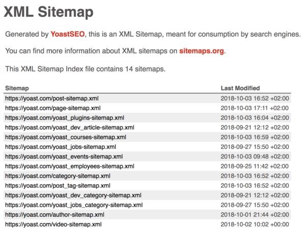
An XML sitemap acts as a blueprint to your website. Not only does this make it easy for you to strategise and plan your platform, but it also provides an easy guide for Google when it comes searching for sites relevant to your business.

an exmaple of an XML sitemap from Yoast
This means that an XML sitemap will support your SEO when your site is constructed, while also providing you with a valuable construction tool in the interim.
Determine how much content your website needs
There is obviously no magic number here, as each website has a different purpose and a distinct audience. Some might like the sleek, minimalist approach to their site, while more academic platforms are likely to be copy-heavy.
If you're approaching this question in pure Google terms, it's important to consider what volume of content is going to get you the best traction in search results.
As the search giant favours fresh, regular content, there's a big emphasis on keeping your website up-to-date with copy that's engaging to crawlers. But there is a catch. Google favours high-quality copy over just quantity, so a balance has to be struck.
It is also worth taking your time on your content, rather than rushing it through a perception that more words equal more clicks.
Who is writing your web content? What you need to know before trying to DIY
The words on your website are much more than just text on white space.
Each virtual pen stroke has a different function and a different purpose. Each word should contribute to making your website stand out against the crowd and set you apart from the competition.
Quality content is desirable to Google, so having an expert on your side allows you to power up the copy you're pushing out. Professional writers have spent years mastering their craft and are far more likely to produce the content you need to rank highly in searches.
Establish your brand and personality
A good narrative – be it a book, movie or game – establishes tone and personality without directly saying it.
You can write cliched phrases like: “We are a family business with decades of experience and dedication towards customer service”. But phrases like this tend to become white noise; where is the proof?
It's also important to workshop what your brand stands for, what your personality is and how you want to be perceived. The content can then be crafted to show this personality without directly saying it. Let the words speak for themselves.
What is your call to action? Where is it located?
Your calls to action are essential elements on your website and should be strategically placed to act as signposts to guide your audience.
A clear call to action needs to be established; what do you want your audience to be doing? Buying? Subscribing? Following your social media? Make the desired action clear to identify.

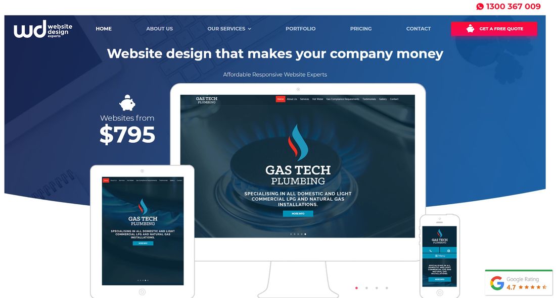
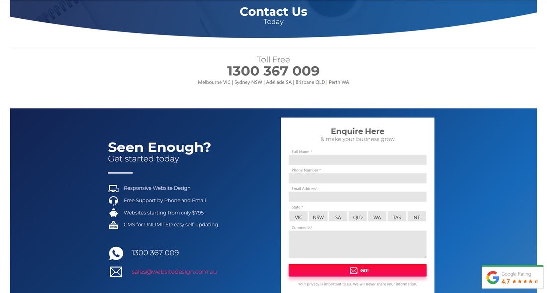
Our calls to action are clearly seen across our website
Who is your target audience?
Before developing content, a clear demographic needs to be determined so you can angle your copy to suit.
Analyse your current customer base and also the customers going to your competitors to assemble a dossier of who your typical customer is.
It is highly important that the web design and content of your website are developed to be welcoming to this demographic, easy for them to navigate, and have calls to action that they are likely to respond to.
The critical pages your website needs
When you are mapping out your website, there are fundamental pages that need to be factored in first. Here are the pages your website cannot do without:
Home: You know what they say about first impressions – you only get one of them. This is the entrance to your digital shopfront, and it is vital this page is done right, or you will lose volumes of potential new business.

This page should feature, at a bare minimum, a clear headline describing what you do or who you are. Give enough calls to action to funnel visitors to different stages of the buying cycle, at least one supporting image or video, and links to case studies or testimonials. Beyond everything, opt for content describing what you do and the benefits on offer, as well as clear navigation and graphic metrics that prove your success.
About: This is a page commonly overlooked as businesses focus on their goods and services pages – which can be poison for your website. Primarily, your about page is one of the most important spots on your site, as it's likely your visitors are looking to check you out. Who are you? What do you do? Why should they care? Why should they invest in our brand?
A threadbare about page is highly likely to turn away visitors who want proof of your integrity before they act any further.
Contact: This is another overlooked page that is critical to your success. It can be easy just to populate this page with an online form, but in reality, a majority of mobile users won’t fill this out.

When customers go looking for something more, 51 per cent say there is not enough information available on this page, so having surrounding information and contact details is paramount.
Include all of your primary points, including links to your social media accounts and any phone numbers to improve the conversion rate of visitors trying to get in touch.
Blog: We've already said Google loves quality content. As well as quality, the search engine loves new material – especially when it is good.
Your blog page is your direct line to your audience, a way for you to establish yourself as a thought leader in your industry, provide value to your audience and open up engagement by cross-posting this content on social media channels.
Other pages to consider
Once you have populated the big four, you can start to prioritise your products and services page. Beyond these, other areas you may choose to focus on include:
FAQs: This can be included on your about page, or housed separately.
Latest news: If your business plans on engaging with the media, this is the place to park your media releases and any articles that show off your brand.
Privacy policy: This can be included on your home or about page, but for the ultimate effect on trust, it should have its own dedicated page.
Terms and conditions: If there are rules and regulations associated with your business, industry and/or your page then a dedicated page is required to outline them.
The importance of landing pages
When it comes to future marketing, these pages are vital for your success. Think of these as purpose-built pages where visitors are funnelled to.
Each of these pages has information on direct services or product, so when people are sent to your site from social media campaigns, they land on these pages where they can act immediately.
These pages must include a direct call to action – usually, a buy now, book now or learn more button.
Landing pages don’t have to be included on your homepage navigation. They often sit away from the general public and are only accessed through links from a specific campaign (e.g. a social media ad you're running), making them trackable as well.
Things to avoid
Heard the saying ‘throw it at the wall and see what sticks’? It’s a terrible way to prepare food and an even worse way to plan your content.
Another thing to remember is not to be too highly structured. The best small businesses are nimble and agile, meaning you should be willing and able to act quickly to change your content if trends change or your existing strategy is not working.
And finally, don’t try and make your site a place where everyone on the planet is going to come and buy from. Defining your target audience is vital so that you are getting the right quality of people clicking through, rather than the right quantity.
Find out more about nailing your website layout by getting in touch with Website Design’s experts now on 1300 367 009.
